Empowering an Education Initiative
Building a new brand to promote Community Schools in NYC
Challenge
The New York City Department of Education manages the largest school system in the United States. To promote its community schools initiative, the DOE wanted a new brand that would help a broad range of stakeholders (corporate partners, policymakers, parents, and the media) understand the advantages of this innovative strategy. To do this successfully, it needed to show a broad range of constituents that this was an initiative worth being a part of. MBLM offered support pro bono as part of a public-private joint effort.
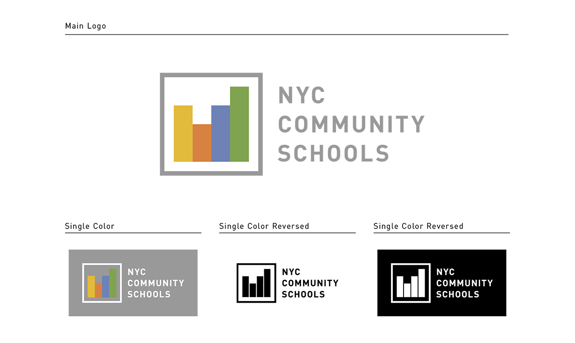
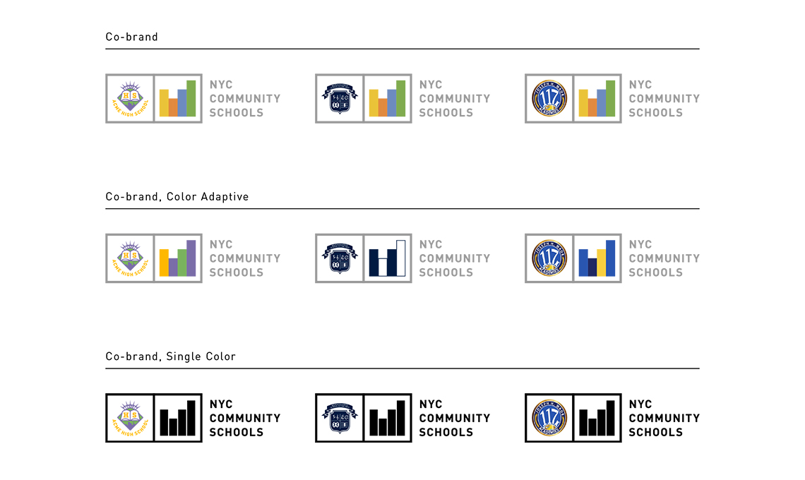
Working closely with DOE’s Community School’s team, MBLM began to develop a brand strategy, which would include a new promise, values, and mission, creating a single-minded focus for the brand. After reviewing existing materials, interviewing key education professionals, and visiting a community school, we built the new brand around the concept of “Support From All Sides.” Based on the brand intimacy archetype of enhancement (associated with becoming better, smarter, more capable, or more connected), this concept highlighted the holistic approach that community schools take to empower students’ success, nurturing them academically as well as psychologically, physically, and socially. From there, MBLM created messaging and a new identity, including a new logo that shows four different-colored rectangular blocks lined up in a row to depict both the idea of buildings and books. It also suggests an upward-trending bar chart to represent community, education, and strategic growth in one symbol. This logo was designed to work in tandem with specific school logos, to communicate both solidarity across the community schools initiative and pride within each individual school.
Results
The result was a unifying new brand that educators, families, and community partners could be proud of. By capturing the advantages of community schools with a simple yet powerful new story, this new brand celebrates the communities that make education possible and highlights the benefits of collaboration. The brand’s new identity creates consistency across all community schools, uniting them under one initiative while allowing each school to express its uniqueness.
With a cohesive story and identity, the objectives and advantages of community schools have become more clear, allowing the initiative to garner support within the New York City area and encouraging more students and families to unlock the shared benefits of collaboration.