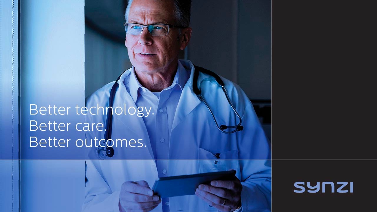
Enabling a New Currency of Health
Rebranding a category leader
Challenge
Verisk Health, a leading health-care analytics firm, was recently acquired and needed a new brand within 90 days.
Working closely with the marketing team, MBLM shaped a comprehensive and fast-paced brand program, starting with creating the brand essence. Utilizing its brand intimacy insights, MBLM positioned the brand around the archetypes of enhancement (customers become better through use of the brand—more intelligent, more capable, and more connected). This resulted in the creation of a new and bold promise centered on the idea of New Currency, with health being seen as the most valuable form of currency. A new corporate name was selected: Verscend, which communicates both ascendance and growth. The name was also a nod to their past and a tribute to their future (being owned by Veritas Capital), suggesting truthfulness and integrity. A bold new identity was created–one that was modern and elegant, using vibrant colors like magenta and purple. MBLM then moved on to the experience phase of the engagement, crafting a series of templates, brochures, brand and corporate videos, presentations, and launch materials.
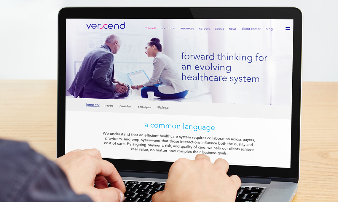
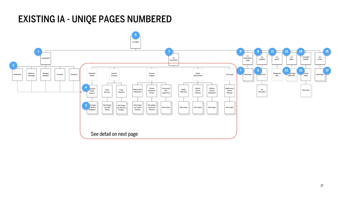
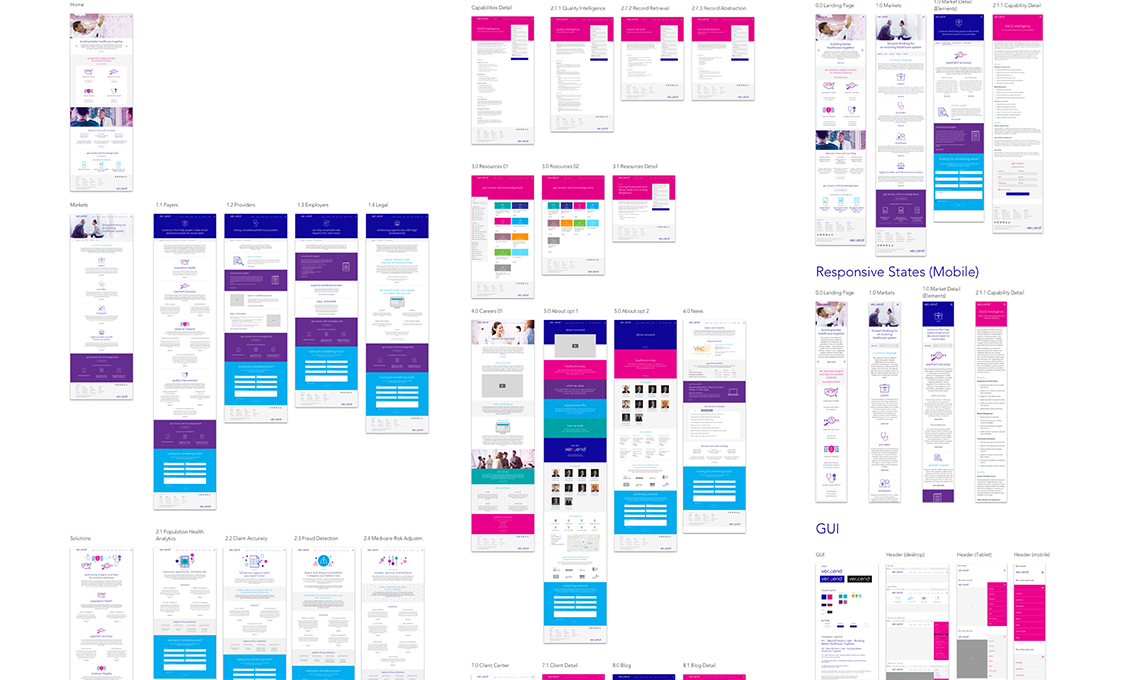
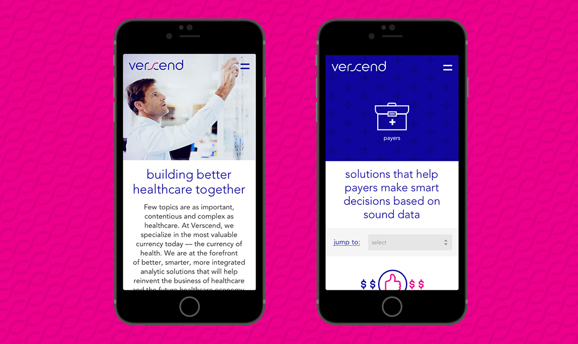
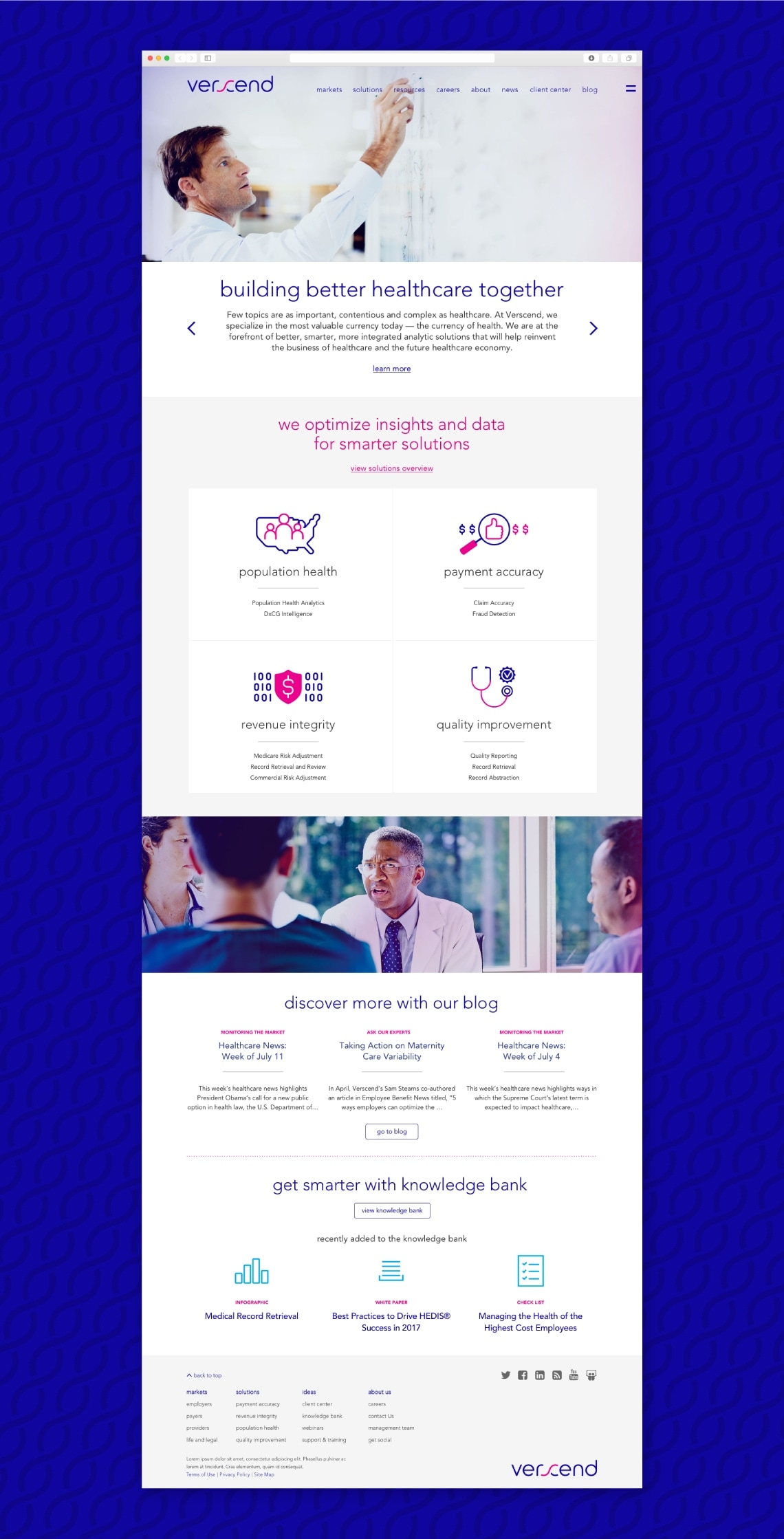
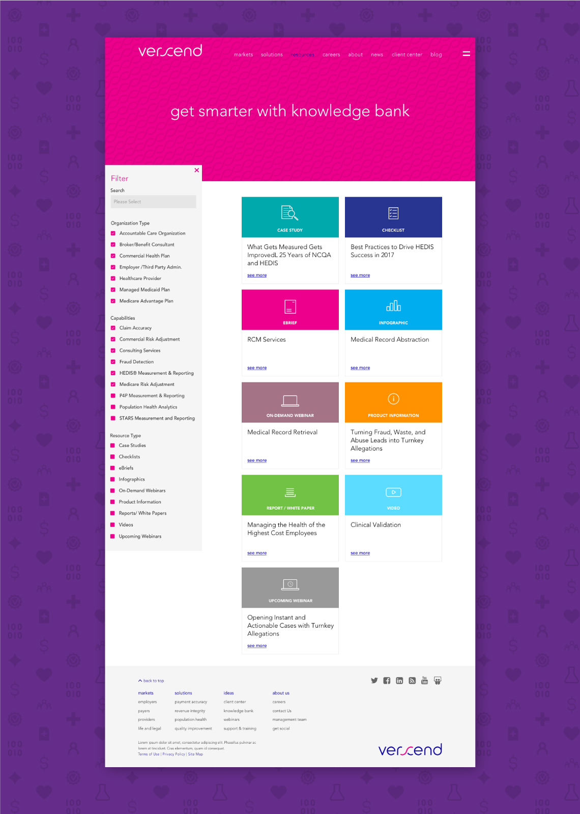
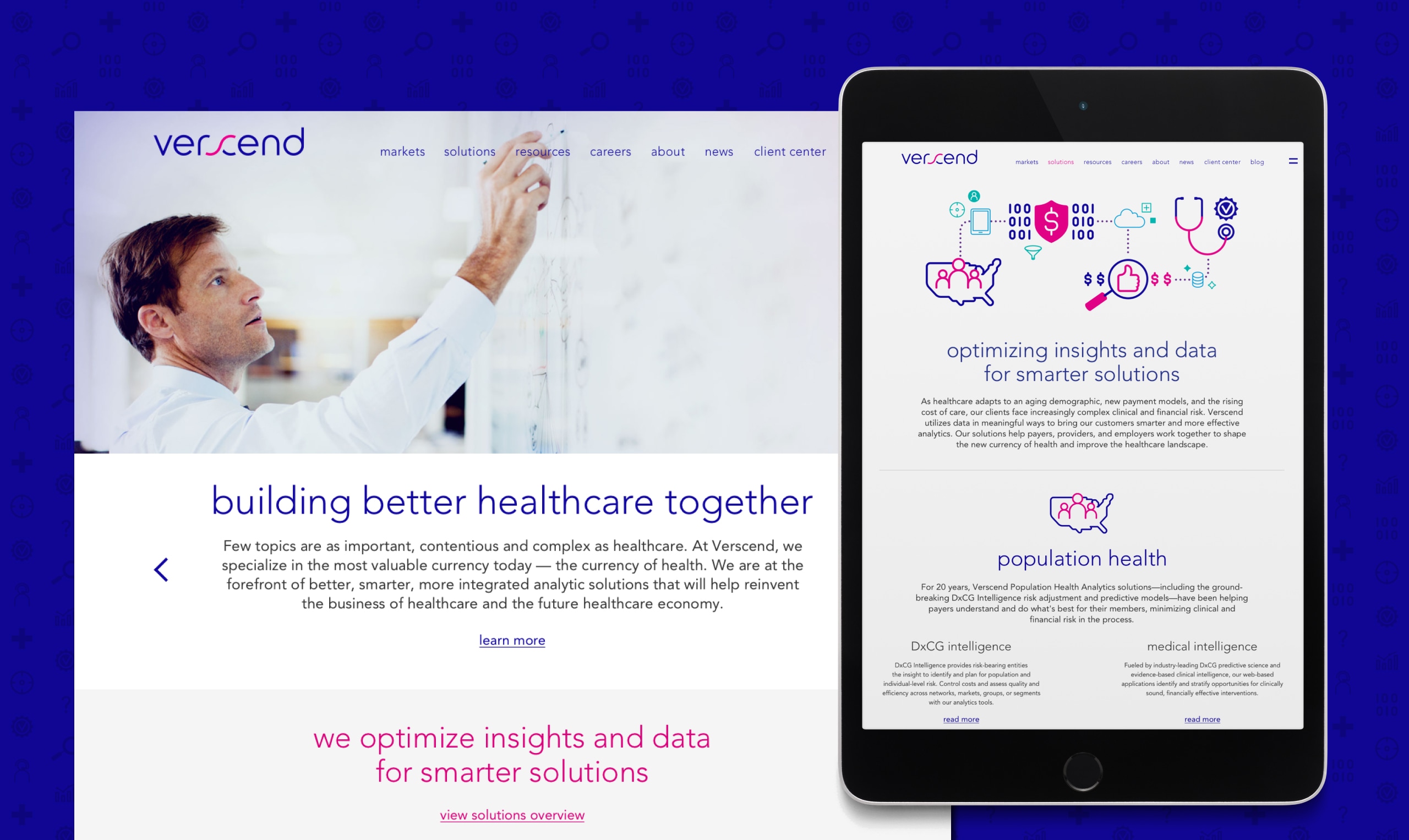
MBLM also redesigned Verscend’s website. In order to go from design to launch in under a month, MBLM based the redesign largely on how the pages were previously laid out so that existing templates could continue to drive the pages.
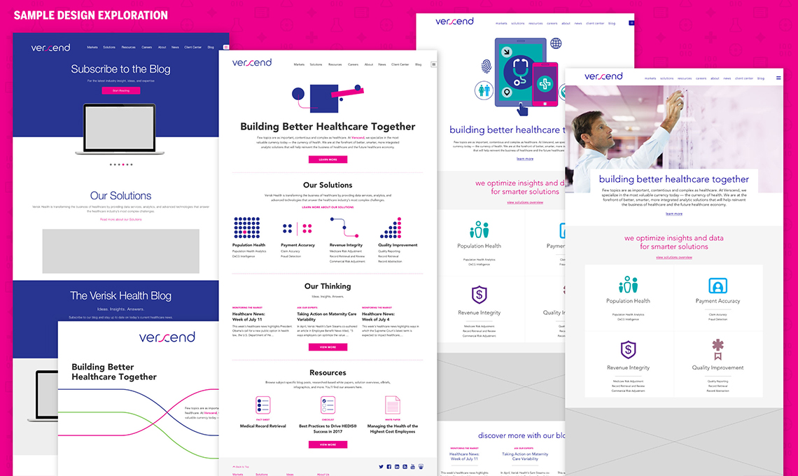
The result was a clean, bright look and feel that made use of vibrant colors and a new icon and illustration style. MBLM simplified the pages and prominently staged the solutions and thought leadership content. MBLM also developed a system for using typography and background patterns rather than needing to source photography or create an image for every blog post. This freed up client resources to focus on making more significant improvements.
MBLM used prototyping tools to hand off specifications to the client development team in daily drops. This seamless process enabled both sides to make progress and maintain the momentum needed to launch the site on time. The finished site presented a fresh new face for the brand without interrupting its role as a significant lead generation tool.
Results
The result was a clean and bright look and feel that made use of vibrant colors and a new icon and illustration style. We simplified pages and more prominently staged the solutions and thought leadership content. We also developed a system for using typography and background patterns rather than needing to source photography or create an image for every blog post. This freed up client resources to focus on making more significant improvements.
We used prototyping tools to hand off specifications to the client development team in daily drops. This seamless process enabled both sides to make progress and maintain the momentum needed to launch the site on time. The finished site was a fresh new face for the brand without interrupting its role as a significant lead generation tool.
Awards
Web Marketing Association’s Web Awards 2017
Standard of Excellence, 2017