Putting People First
Empowering participants in Medicaid-sponsored healthcare programs through self-directed care
PPL is active in an extensively regulated niche of health care called self-directed care by functioning as a financial management service. PPL empowers private individuals whose care is covered by Medicare to manage their home health-care service providers. PPL enables these participants to hire their own caregivers and handles time tracking, invoicing, and other aspects of the employment relationship that a person is not permitted to manage themselves.
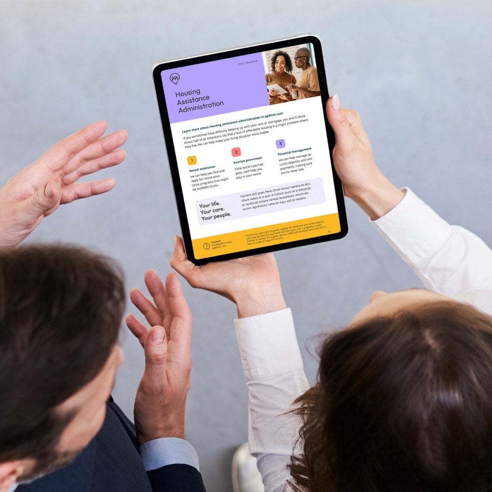
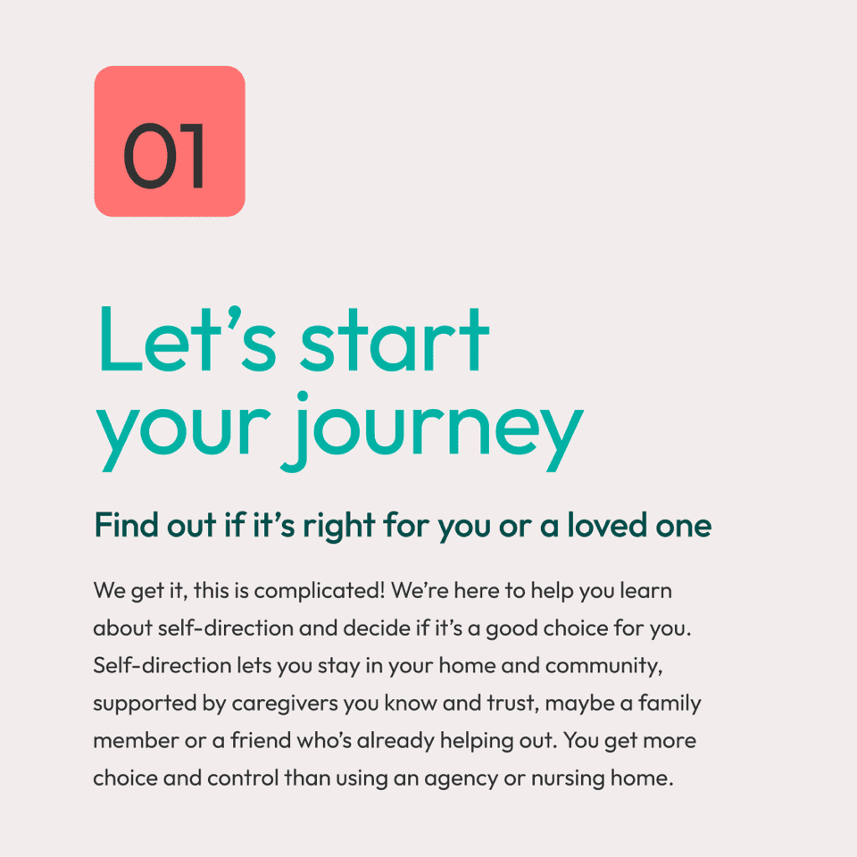
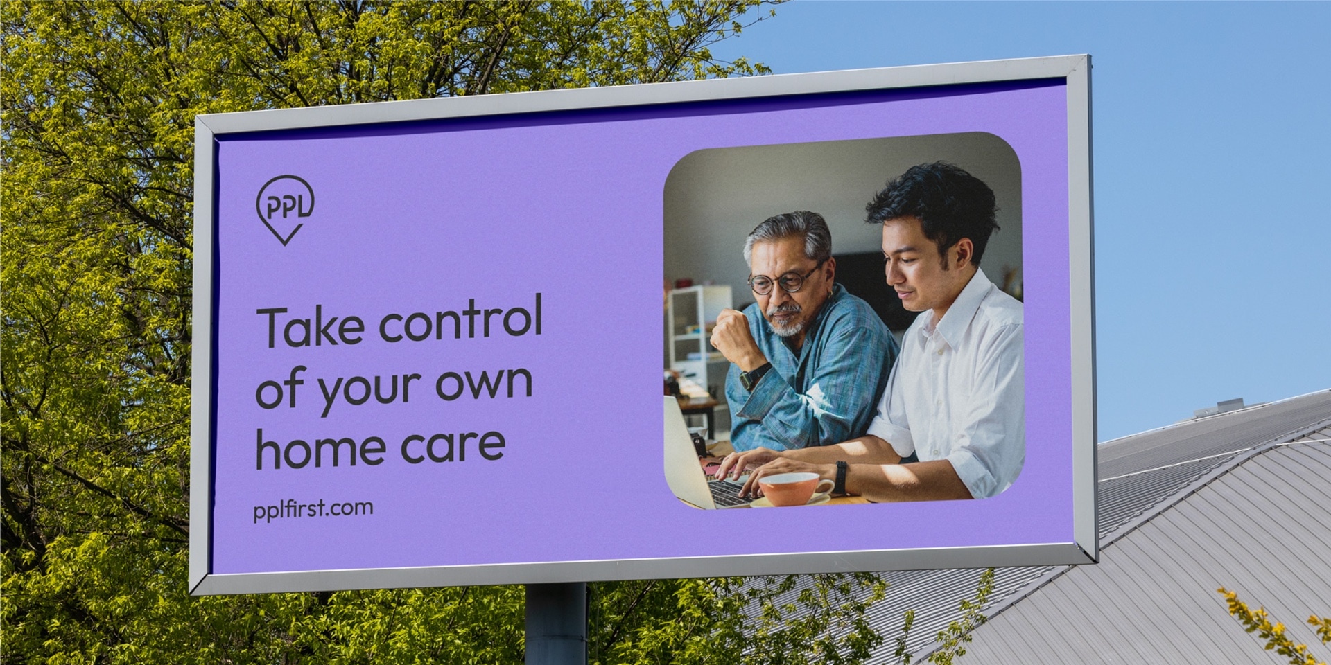
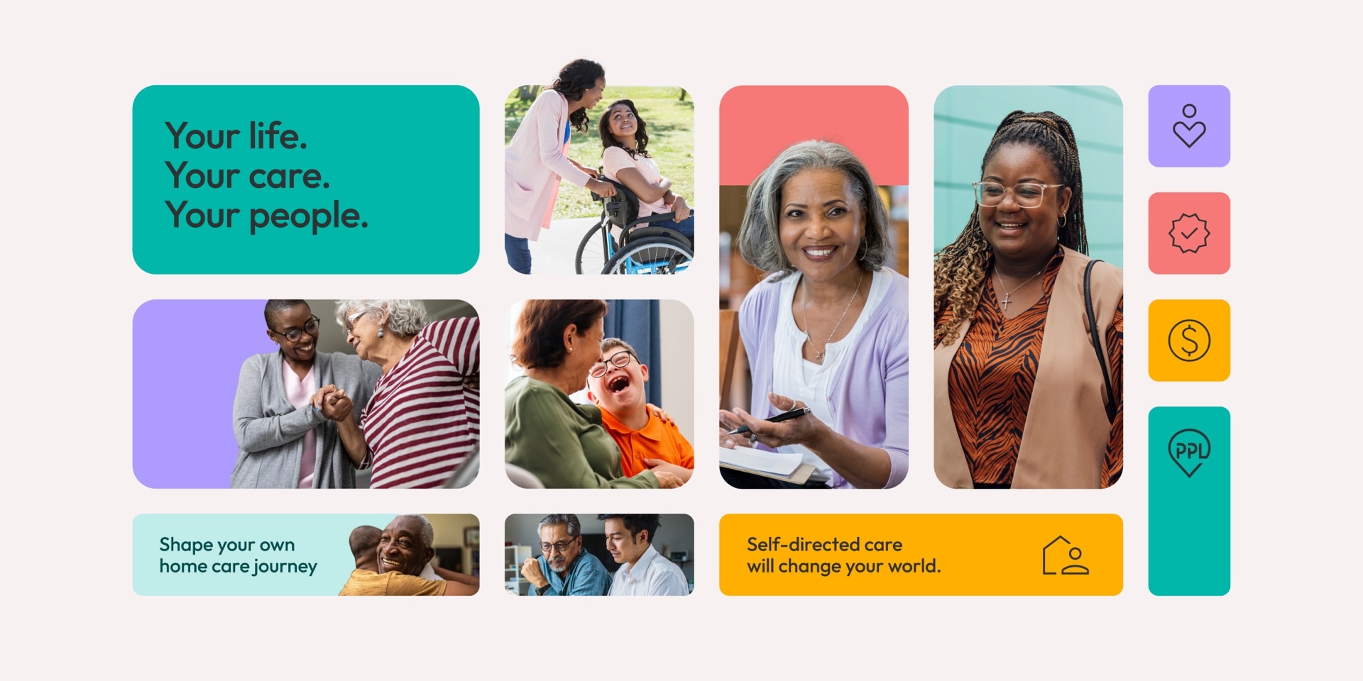
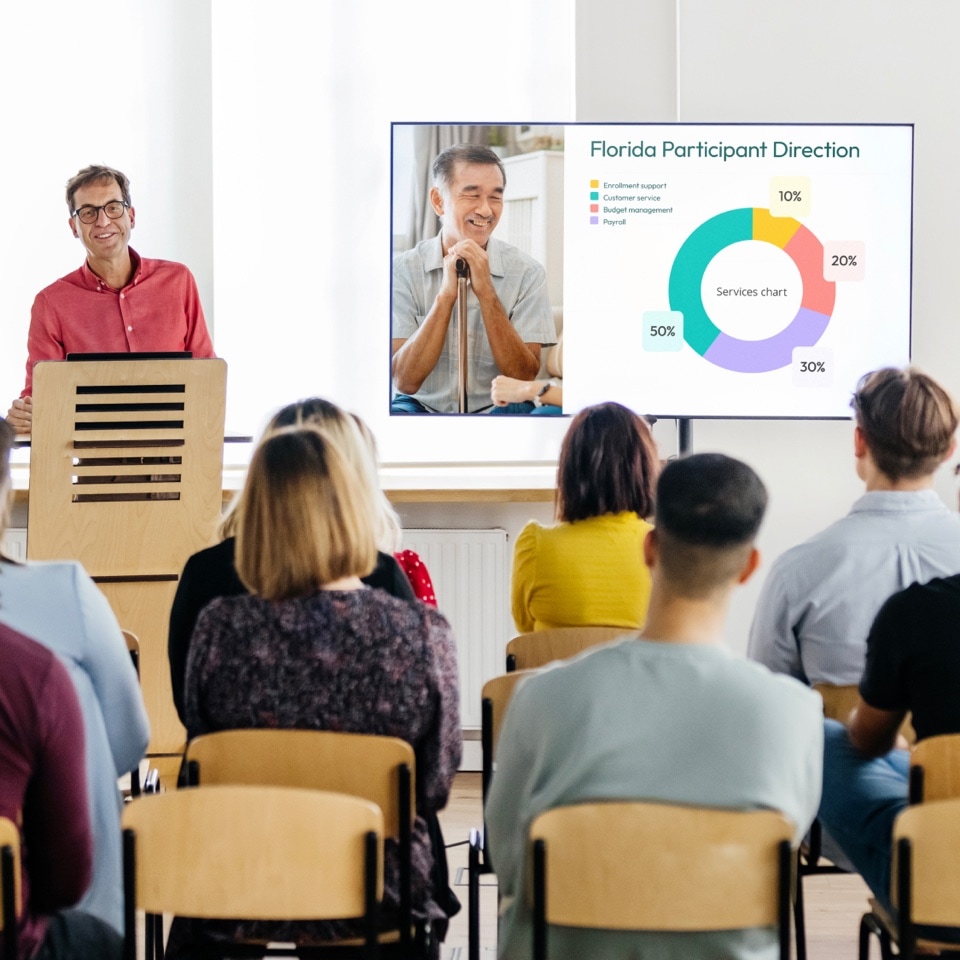
PPL is responsible for managing 45+ programs that are available in states across the US to service populations with physical impairments or mental and age-related needs. This complexity means that PPL has to address a range of audiences from the people in need of care to their loved ones and caregivers to state agencies.

Challenge
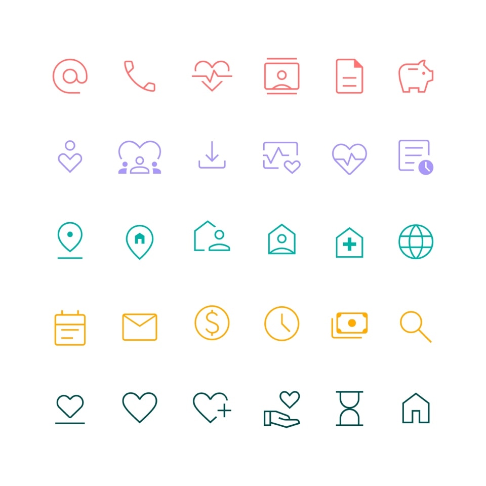
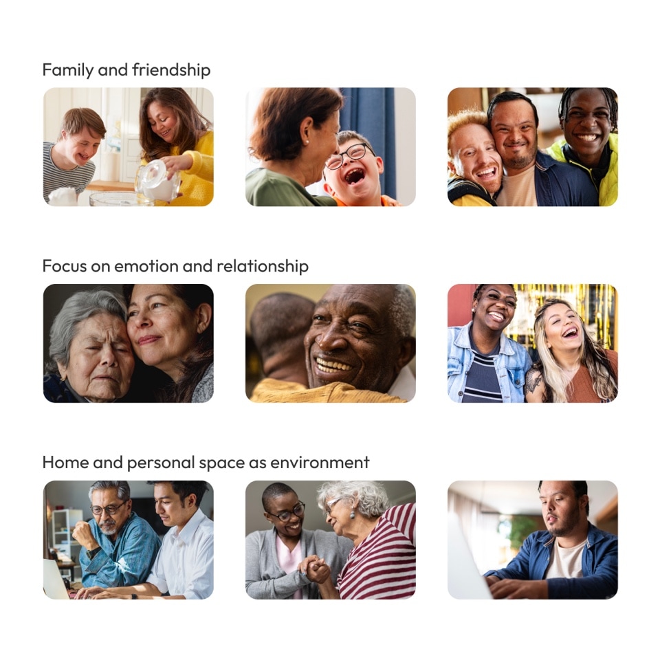
MBLM was asked to evolve and modernize an existing identity system by retaining the logo and introducing colors, photography, iconography, and patterns that capture the spirit of the PPL brand. PPL stands for public partnership. The new marketing team wanted to emphasize the benefits for people and make more use of the initialism PPL, which could also be read to sound like “people.” The website was migrated to the domain pplfirst.com to further underscore who would be benefiting.
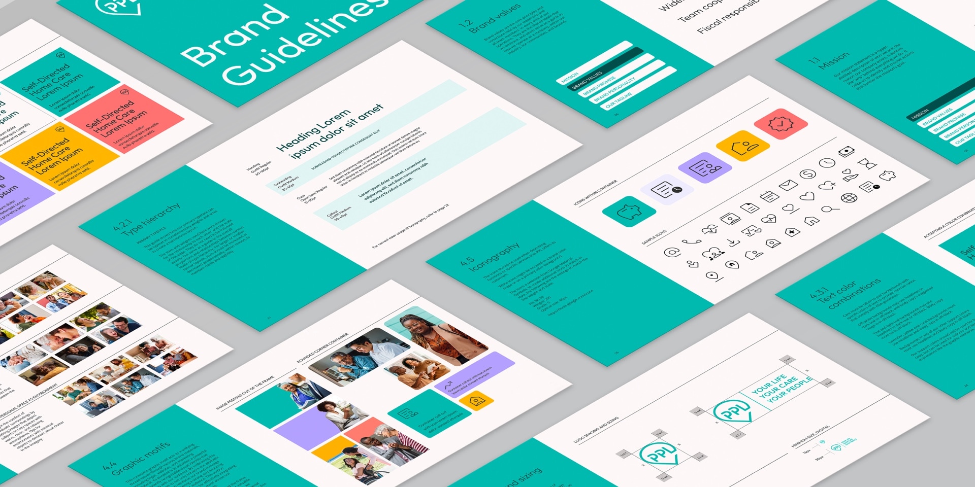

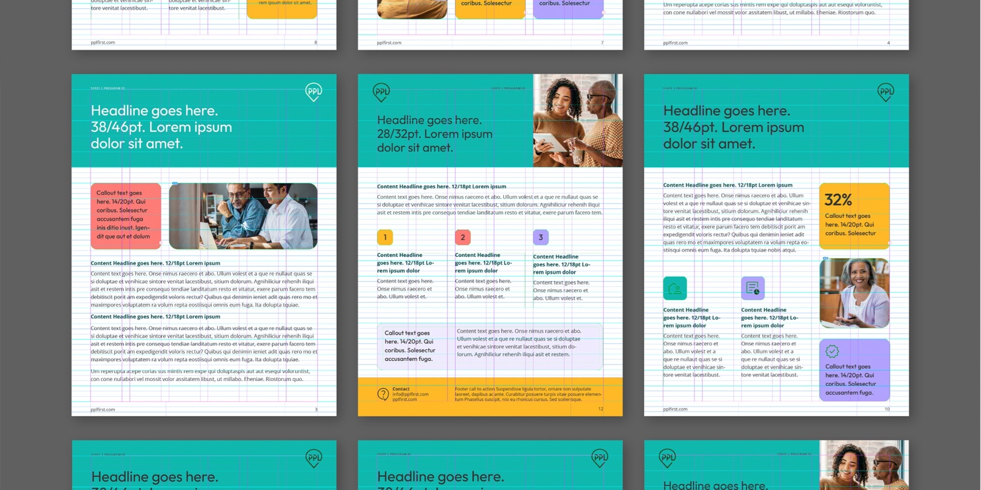
The new identity needs to be approachable to participants yet professional when viewed by state agencies. The selected colors combined calm colors, such as a dark and a light teal, as primaries with an extended palette of accent colors to be used to draw attention, guide, and provide visual interest. MBLM selected a comprehensive collection of photography.
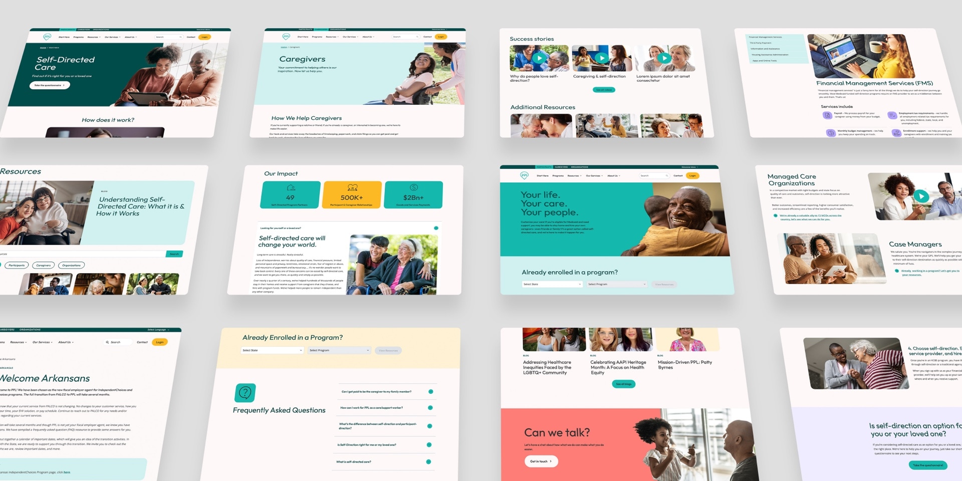
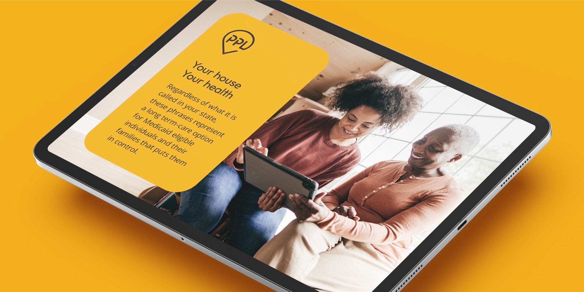
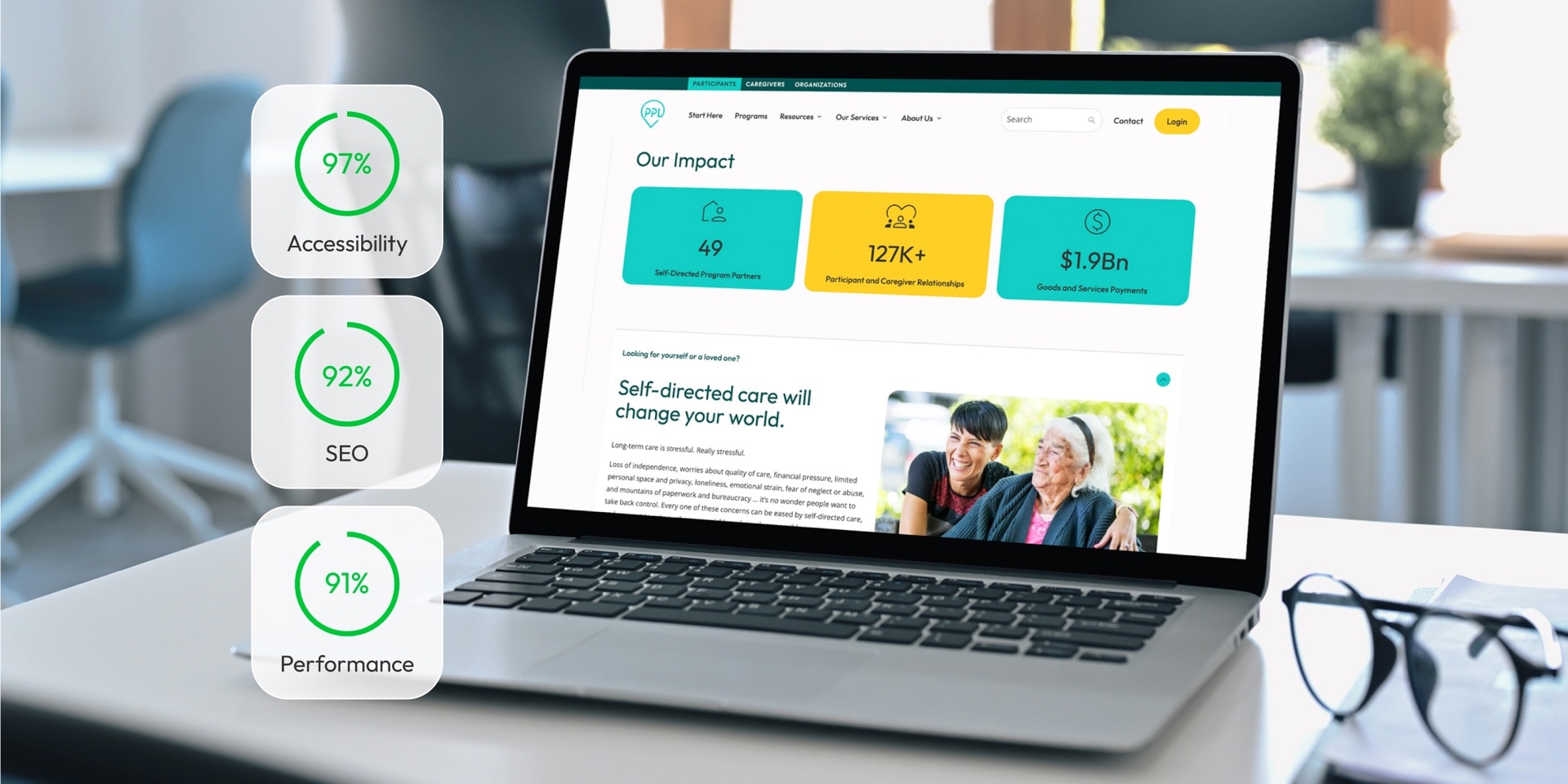
The website has a number of additional requirements to fulfill beyond the typical communication of what we do and for whom, which demanded a sophisticated understanding of user experience and behavior. An interactive decision-tree questionnaire helps participants determine whether they are eligible for self-directed care and what steps to take to request participation in a program. A comprehensive program catalog enables participants to find the program they are eligible for. Creating a website for people facing physical, mental, and age-related needs also required that their abilities for processing information, reading level, and motor skills are factored into the content and user interface. The site achieved high accessibility rankings (96+) in extensive testing with Google Lighthouse tools.

