Rebranding an Independent Commercial Finance Firm
Moving from Complexity to Clarity
- Distinctive brand name aligned with new brand promise and messaging
- Bold new brand identity to show sophistication and modern focus
- High-level design guidelines to enable marketing teams to scale efforts
- User interface design of key screens to efficiently articulate the digital presence
- Delivery of UI patterns and specifications to outside development team, maximizing design fidelity


CG Commercial provided direct lending with deal-structuring expertise related to equipment and project finance needs for midsize companies. The company specialized in challenging situations that did not easily fit traditional lending standards. As it grew its business, it wanted a brand to better align with its focus and new, broader orientation.
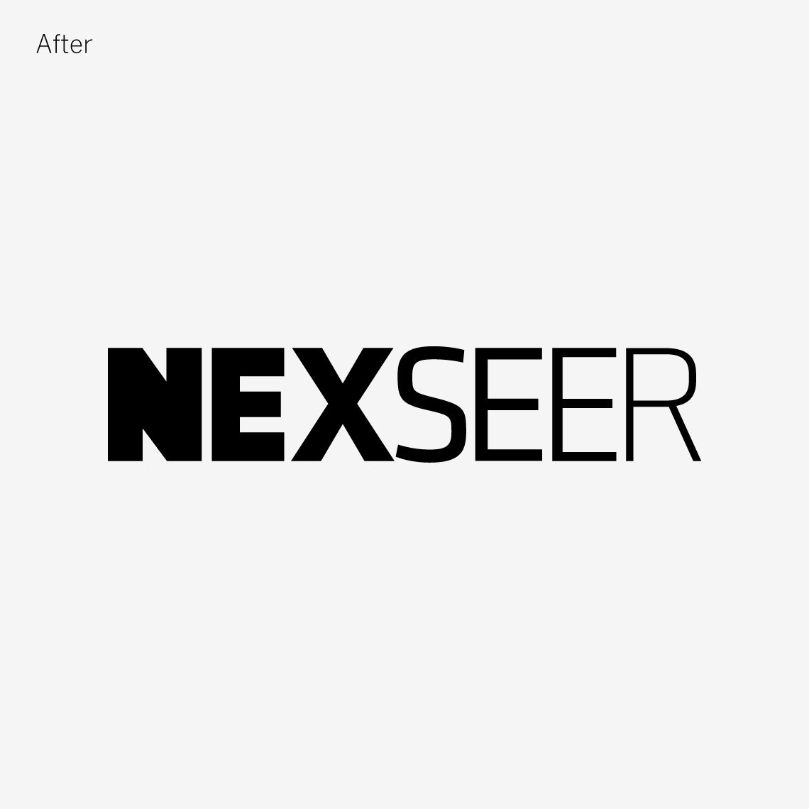
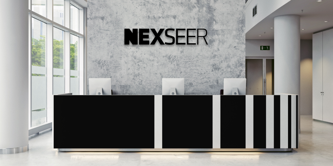
In the essence stage, MBLM created a new name—Nexseer—that spoke to the firm’s ability to see beyond the norm and into what’s coming. A brand promise around the idea of moving from complexity to clarity highlighted its deal-making prowess. Complementing this was a bold, stylish visual identity that reinforces a progression or change by transitioning from extra bold to light typography. A new design system consisting of a high-contrast green color, striking iconography, and abstract black-and-white photography depicting the beauty of machinery and engineered products works together to establish a distinct, ownable style for the brand.


During the experience phase, a streamlined web design was created with an aggressive timeline.
MBLM developed a comprehensive user interface design system and designed a number of pages for the launch version of the site. We then collaborated and delivered production files in the form of browser prototypes that could easily be applied. New corporate materials were also developed, ensuring that Nexseer’s go-to-market presence reflected the new brand and new focus.

