Reflecting a Brand’s Growing Stature
A new strategy and design to foster expansion
- Fastest Growing Retail Bank 2017 award winner
- Fastest Growing Corporate Bank 2017 award winner
- 2018 portfolio reached more than 40,000 million pesos
- Significant increase in branch offices in Mexico City and throughout Mexico
BX+ (with its association “Go for more,” due to the idea it conveys in Spanish) is a financial institution that aims to create simple and personalized solutions through impeccable service.
MBLM was tasked with updating BX+ with a brand promise and identity that would facilitate reaching new audiences and help them open more branch offices throughout Mexico.
After a thorough assessment phase, an opportunity to focus the brand as the best of its kind in the financial sector emerged. We defined a series of target audiences including real estate firms and the agriculture and livestock sector and created specific brand orientations for each client’s unique needs.
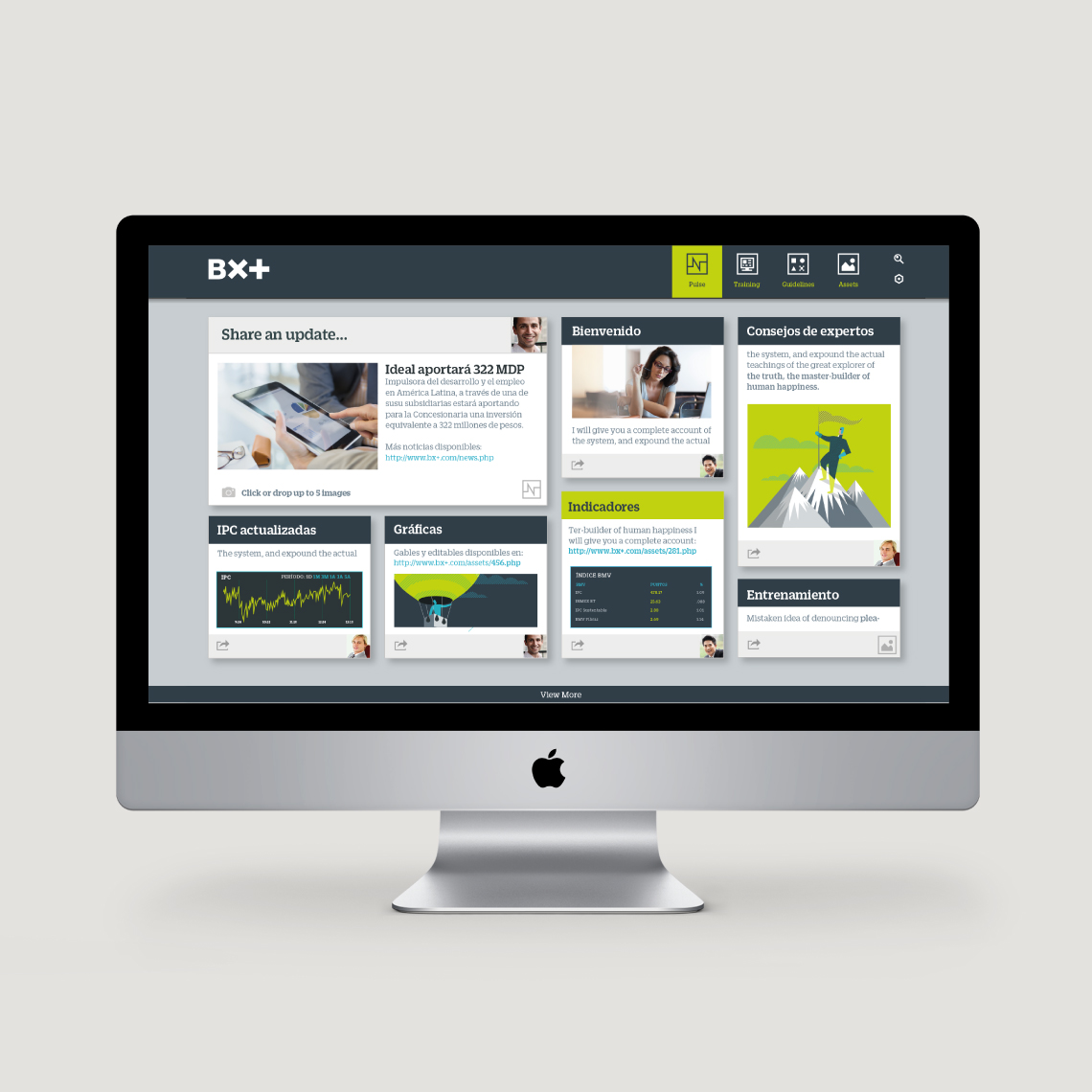
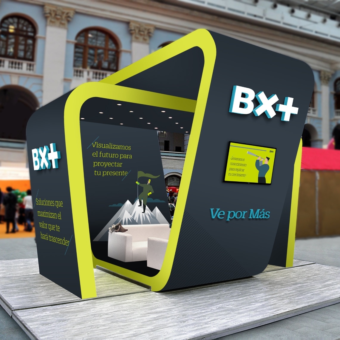
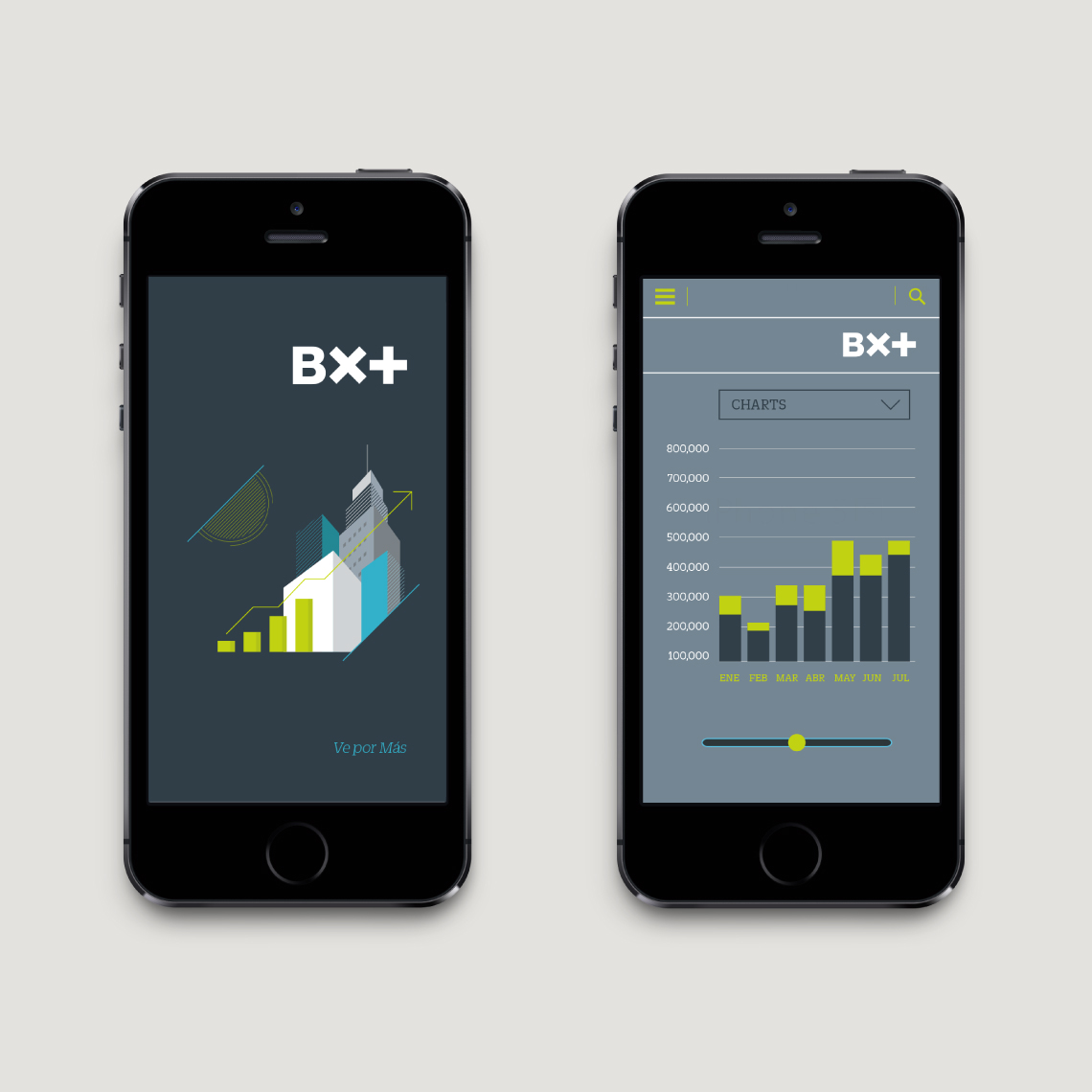
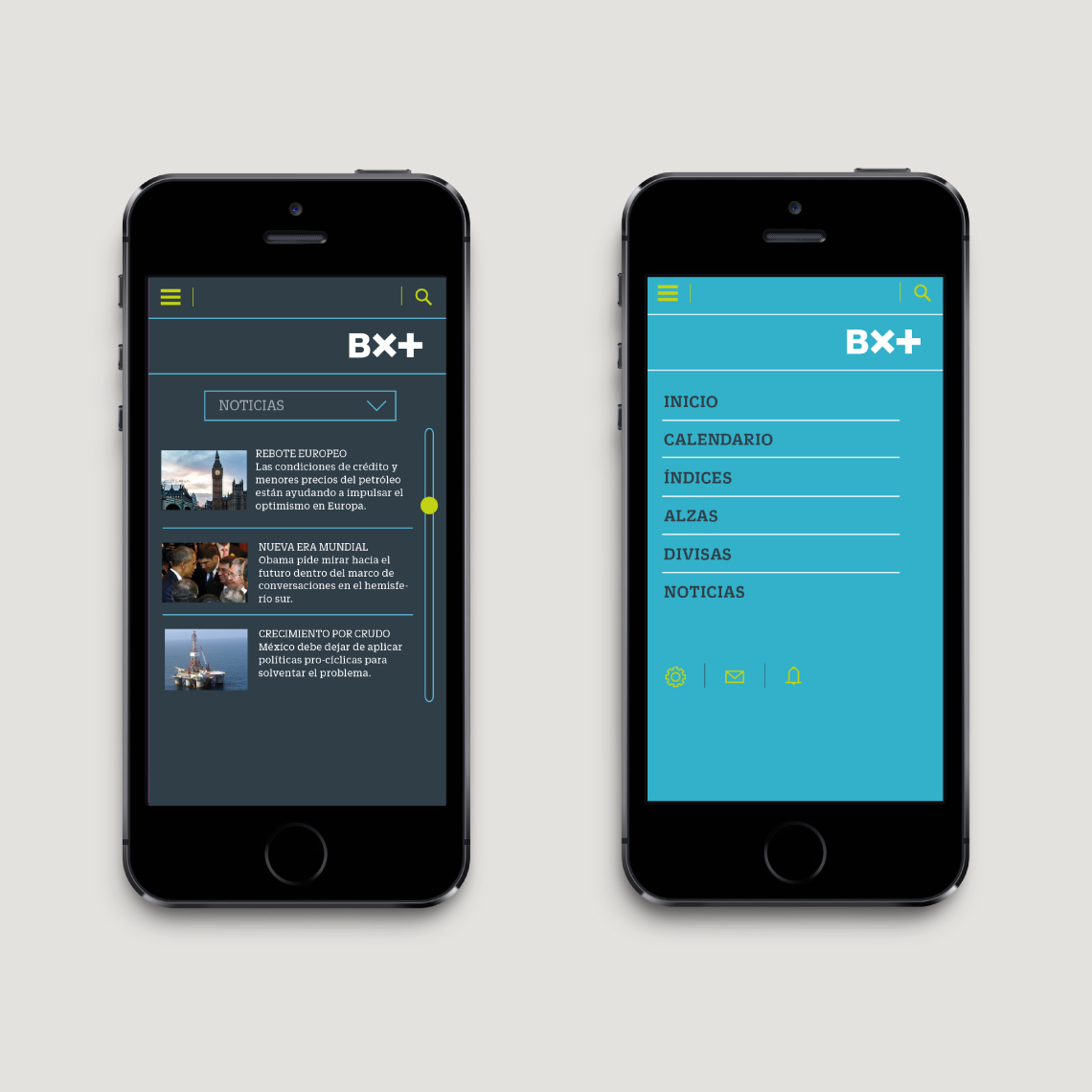
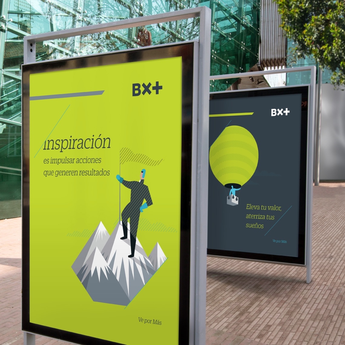
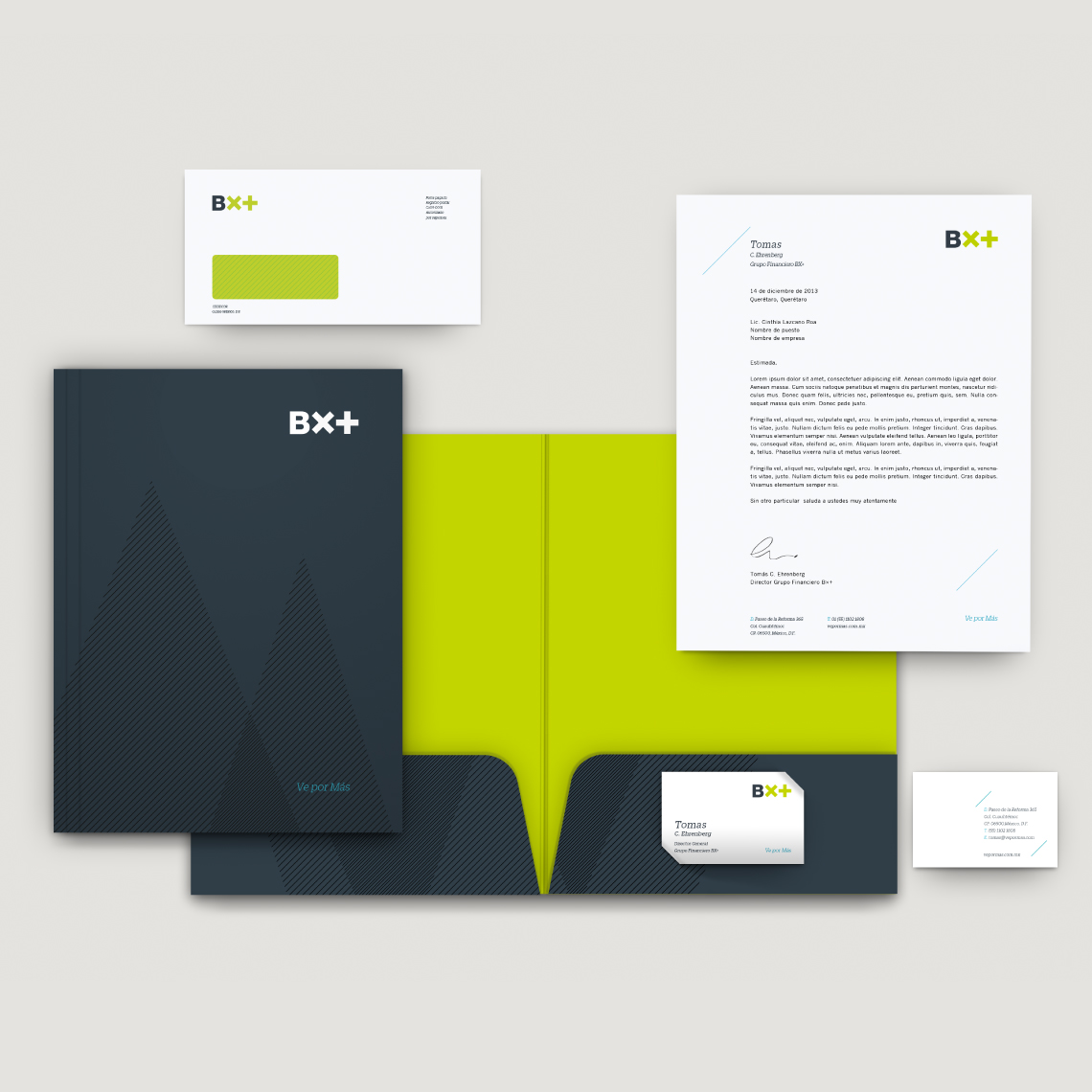
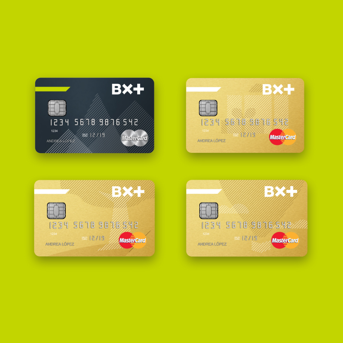
MBLM defined a personality and a verbal and visual identity to further align the brand. The visual identity uses a design aesthetic that helps us to convey complex ideas in an easy and accessible manner. The unique geometric and angular illustration style was created to set BX+ apart form the competition. This style is characterized by the presence of hatch patterns within the color overlay. The hatch patterns add compelling details, such as depth and impact.
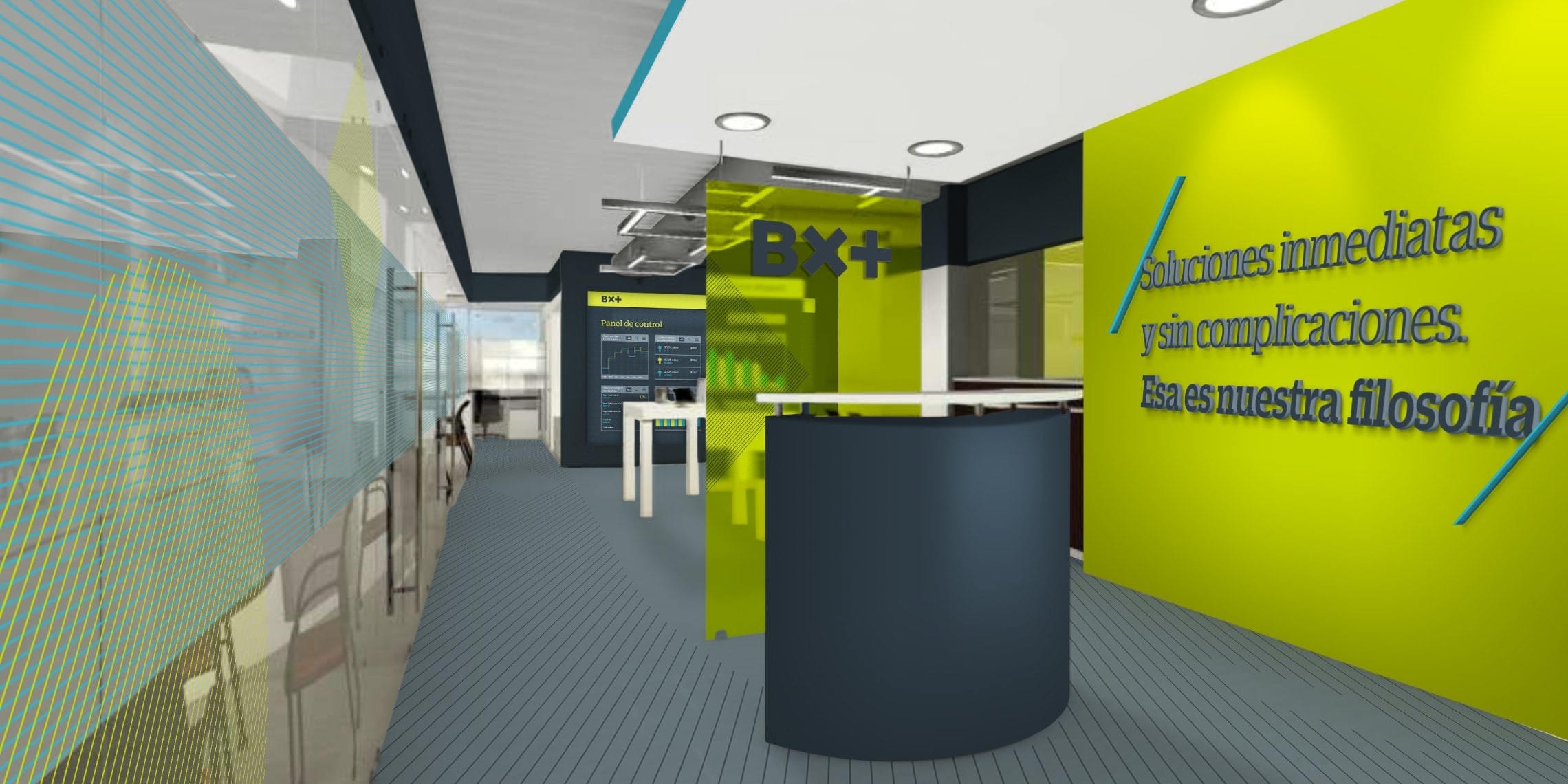
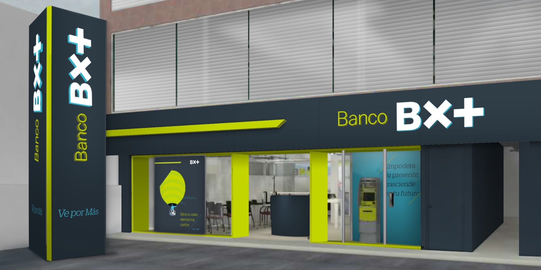
We also designed flexible branch offices, to help facilitate the rapid expansion that BX+ had set its sights on.
The result is a more original, modern and professional brand that manages to convey the seriousness and service quality that BX+’s clients are looking.