In today’s fast-paced digital world, the ability to communicate complex data in a clear and engaging manner is more important than ever. Infographics have emerged as a powerful tool to transform intricate information into visually appealing and easily digestible formats. By combining design, data, and storytelling, infographics can capture attention, enhance understanding, and drive action. This article delves into the art of designing impactful infographics, exploring the principles, techniques, and tools that can turn complexity into clarity.
The Importance of Infographics in Data Communication
Enhancing Understanding and Retention
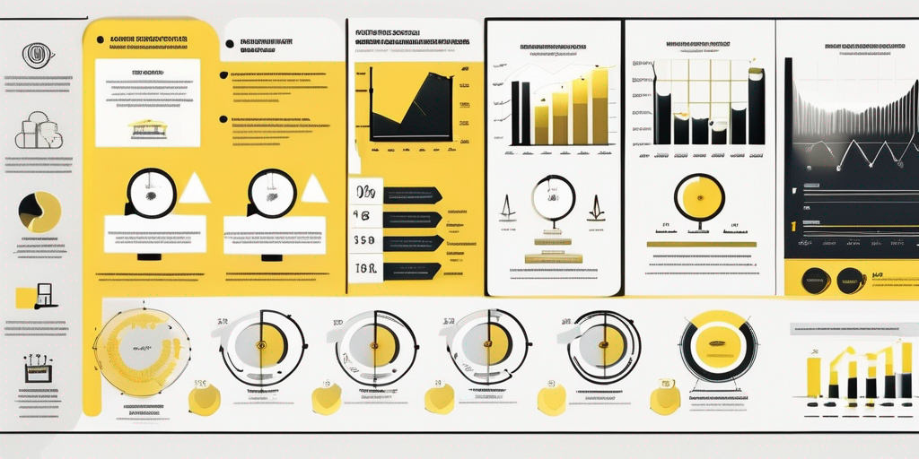
Infographics are designed to simplify complex information, making it easier for audiences to grasp and remember. By using visual elements like charts, icons, and illustrations, infographics break down data into manageable parts. This visual representation aids in comprehension, allowing viewers to quickly understand the key messages without wading through dense text.
Research shows that people are more likely to retain information presented visually compared to text alone. Infographics leverage this by creating memorable visuals that stick in the viewer’s mind. The combination of text and imagery caters to different learning styles, ensuring that the message is accessible to a broader audience.
Engaging and Captivating Audiences
In an era of information overload, capturing and maintaining the audience’s attention is a significant challenge. Infographics serve as an effective solution by presenting data in a visually engaging format. The use of color, typography, and layout can draw the viewer’s eye and encourage them to explore the content further.
Moreover, infographics can convey a narrative, guiding the audience through the data in a structured and compelling way. This storytelling aspect not only keeps viewers engaged but also helps them connect with the information on a personal level, increasing the likelihood of them sharing it with others.
Facilitating Decision-Making
For businesses and organizations, infographics can be a critical tool in decision-making processes. By presenting data clearly and concisely, infographics enable stakeholders to quickly assess information and make informed decisions. This is particularly valuable in environments where time is of the essence, and decisions need to be made swiftly and accurately.
Infographics can also highlight trends, patterns, and insights that might not be immediately apparent in raw data. By visualizing these elements, decision-makers can identify opportunities and challenges more effectively, leading to better strategic planning and execution.
Principles of Effective Infographic Design
Clarity and Simplicity
The primary goal of an infographic is to communicate information clearly and effectively. This requires a focus on simplicity and clarity in design. Avoid cluttering the infographic with unnecessary details or overly complex visuals. Each element should serve a purpose and contribute to the overall understanding of the data.
Use whitespace strategically to separate different sections and guide the viewer’s eye through the content. A clean and organized layout ensures that the information is accessible and easy to navigate, preventing the audience from feeling overwhelmed.
Consistency and Branding
Consistency in design elements such as color schemes, fonts, and iconography is crucial for creating a cohesive infographic. This not only enhances the visual appeal but also reinforces brand identity if the infographic is part of a larger marketing strategy. Consistent branding helps build trust and recognition among audiences, making the infographic more memorable.
When designing an infographic, consider the brand’s existing visual guidelines and incorporate them into the design. This ensures that the infographic aligns with the overall brand image and messaging, creating a seamless experience for the audience.
Data Accuracy and Integrity
An infographic is only as good as the data it presents. Ensuring data accuracy and integrity is paramount to maintaining credibility and trust with the audience. Double-check all data sources and calculations to avoid errors that could undermine the infographic’s effectiveness.
Additionally, be transparent about the data sources and methodologies used in the infographic. Providing this information not only adds credibility but also allows the audience to explore the data further if they wish. Transparency fosters trust and encourages engagement with the content.
Techniques for Designing Impactful Infographics
Choosing the Right Type of Infographic
There are various types of infographics, each suited to different kinds of data and storytelling. Some common types include statistical infographics, timeline infographics, process infographics, and comparison infographics. Selecting the right type depends on the nature of the data and the message you want to convey.
For instance, statistical infographics are ideal for presenting numerical data and statistics, while timeline infographics are perfect for showcasing historical events or project milestones. Understanding the strengths and limitations of each type can help you choose the most effective format for your data.
Utilizing Visual Hierarchy
Visual hierarchy is a key principle in infographic design that involves arranging elements in a way that guides the viewer’s attention. By using size, color, and placement strategically, you can highlight the most important information and ensure that it is seen first.
For example, larger and bolder text can be used for headings or key statistics, while contrasting colors can draw attention to specific data points. A well-designed visual hierarchy not only makes the infographic more aesthetically pleasing but also enhances its communicative power.
Incorporating Interactive Elements
With advancements in digital technology, infographics are no longer limited to static images. Interactive infographics allow users to engage with the content in a dynamic way, exploring data through clickable elements, animations, and interactive charts.
Interactive elements can enhance user engagement and provide a more personalized experience. They allow viewers to delve deeper into the data, uncovering additional insights and information that may not be immediately visible in a static infographic. This level of interactivity can significantly increase the infographic’s impact and shareability.
Tools and Resources for Infographic Design
Graphic Design Software
There are numerous graphic design software options available for creating infographics, ranging from professional tools like Adobe Illustrator to user-friendly platforms like Canva. These tools offer a variety of templates, icons, and design elements that can help streamline the infographic creation process.
For those with design experience, Adobe Illustrator provides advanced features and customization options, allowing for complete creative control. On the other hand, platforms like Canva offer intuitive drag-and-drop interfaces, making them accessible to beginners and non-designers.
Data Visualization Tools
Data visualization tools like Tableau and Google Data Studio can be invaluable for creating data-driven infographics. These tools allow you to import data directly and generate visualizations such as charts and graphs, which can then be incorporated into your infographic design.
By using data visualization tools, you can ensure that your infographics are not only visually appealing but also accurate and data-driven. These tools often come with built-in templates and customization options, making it easier to create professional-quality infographics.
Online Resources and Inspiration
There are countless online resources available for infographic inspiration and education. Websites like Behance and Dribbble showcase a wide range of infographic designs, providing inspiration for your own projects. Additionally, blogs and tutorials can offer valuable tips and insights into the infographic design process.
Engaging with online communities and forums can also be beneficial, allowing you to connect with other designers and share ideas. By staying informed about the latest trends and techniques in infographic design, you can continue to refine your skills and create impactful visuals.
Conclusion: Transforming Data into Visual Stories
Designing infographics that communicate data with impact is both an art and a science. By understanding the principles of effective design, utilizing the right techniques, and leveraging the appropriate tools, you can transform complex data into compelling visual stories. Infographics have the power to engage, inform, and inspire audiences, making them an invaluable asset in today’s information-rich world. As you embark on your infographic design journey, remember that clarity, creativity, and accuracy are key to turning complexity into clarity.