A Bold Identity to Signal Hope
Modernizing a leading charitable organization
- Reinvigorated organization and signaled change: first redesign in 20 years
- Became centerpiece for new membership programs
- Dedicated outreach sharing new identity with key audiences
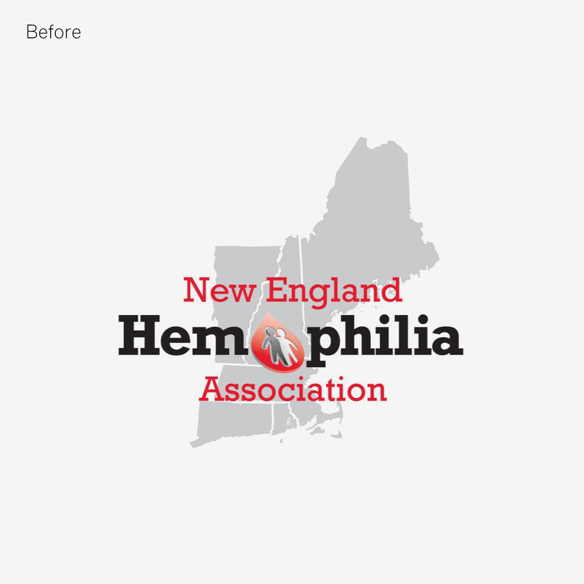
The New England Hemophilia Association (NEHA), was founded in 1957 to serve individuals and families with all types of bleeding disorders, who need information, emotional support and an organization to voice their needs and concerns. This dedicated group was seeking to modernize their identity and showcase a new, bold presence as they continue their important work of education, support and advocacy. MBLM worked closely to understand the organization and what made it successful for over 50 years. Our design team were struck by the theme of family and sense of community at NEHA. This inspired the designers to create a compelling identity where a dark red blood droplet embraces a smaller white droplet to symbolize a hug. This helps convey the caring nature of NEHA, in addition to an uplifting and dynamic spirit which is woven into the fabric of our community and our ethos. Furthermore, the logo shows drops coming together, to demonstrate an optimistic spirit for curing hemophilia.


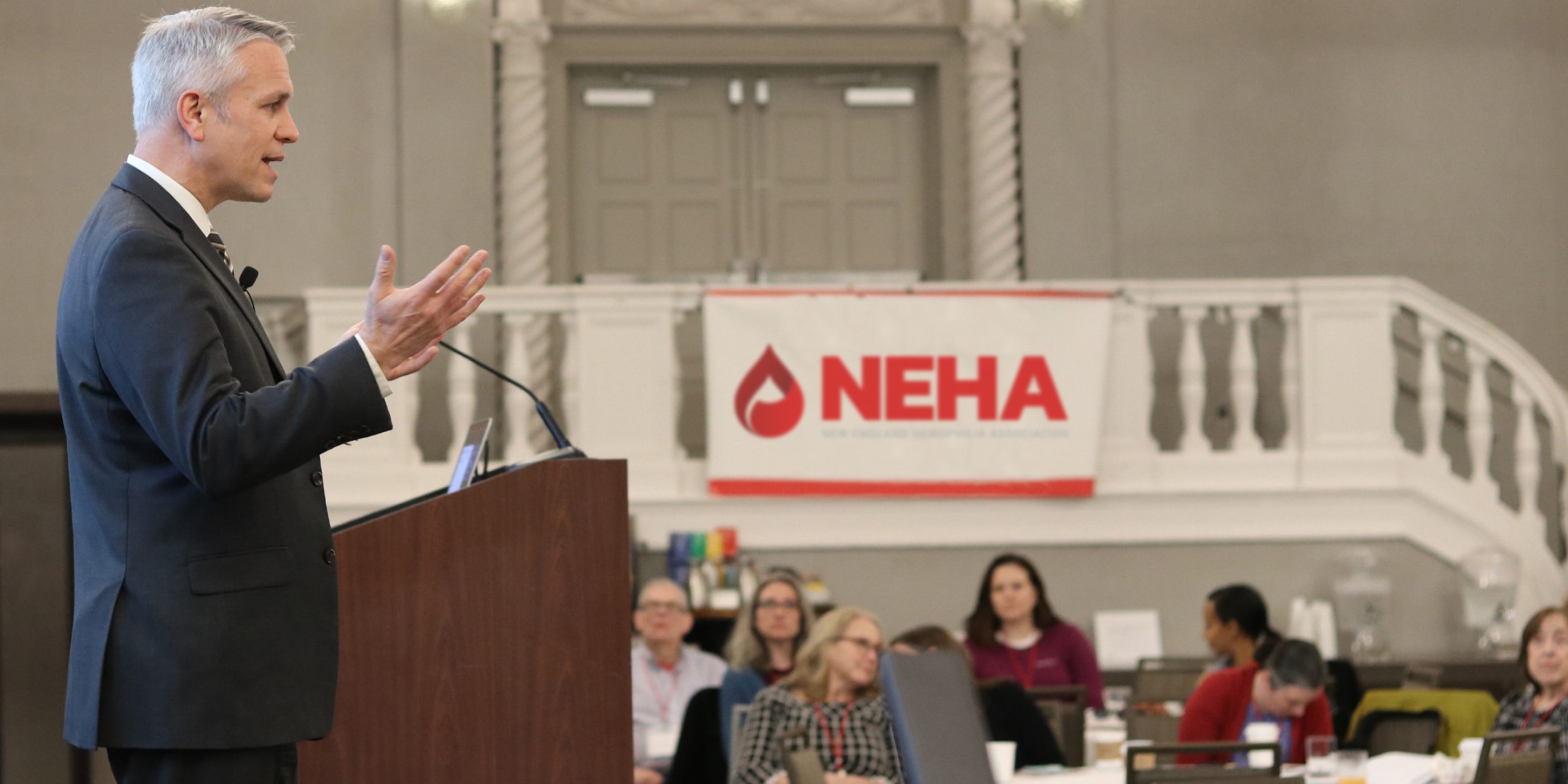
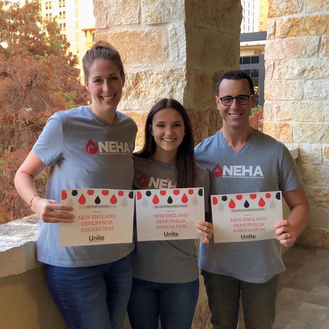
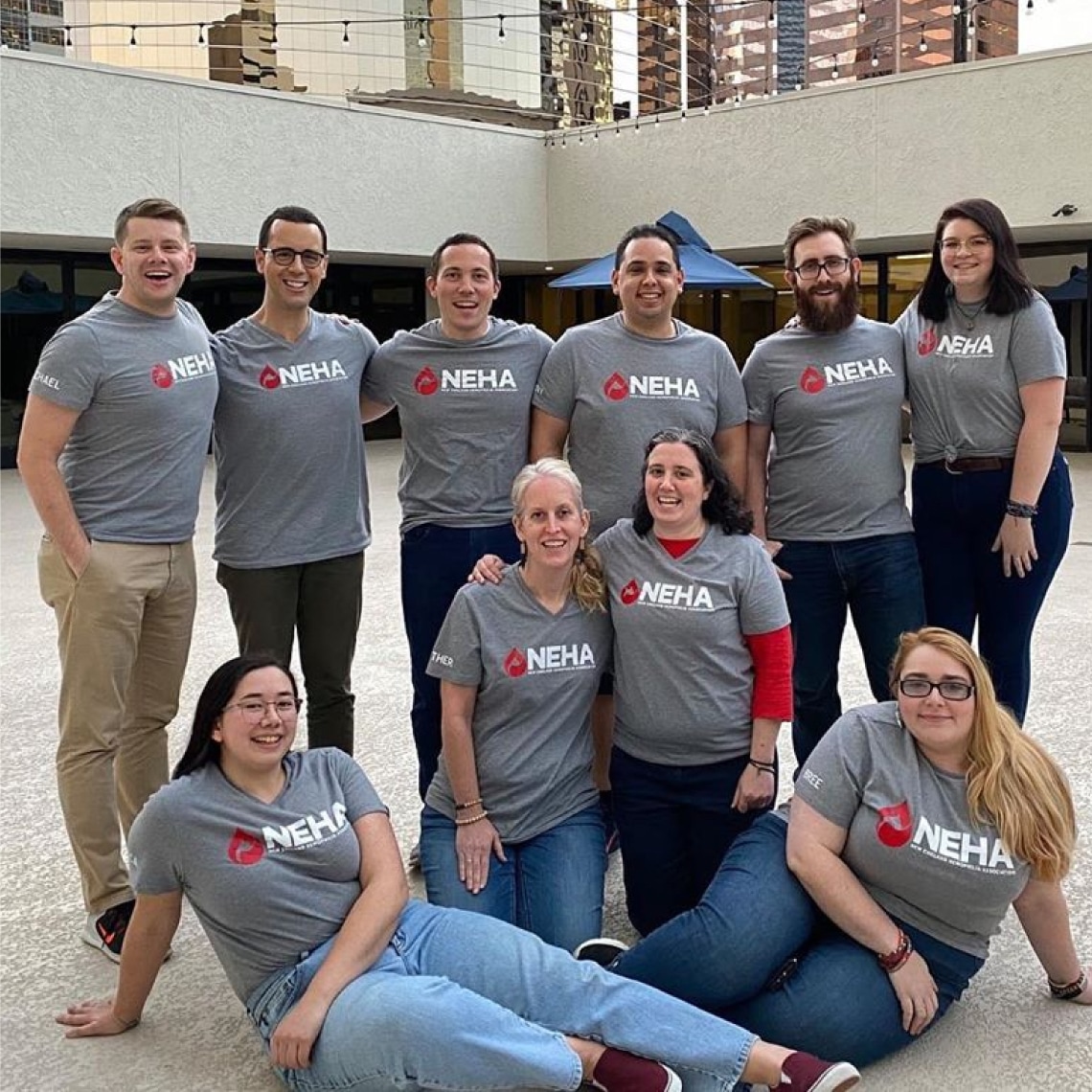
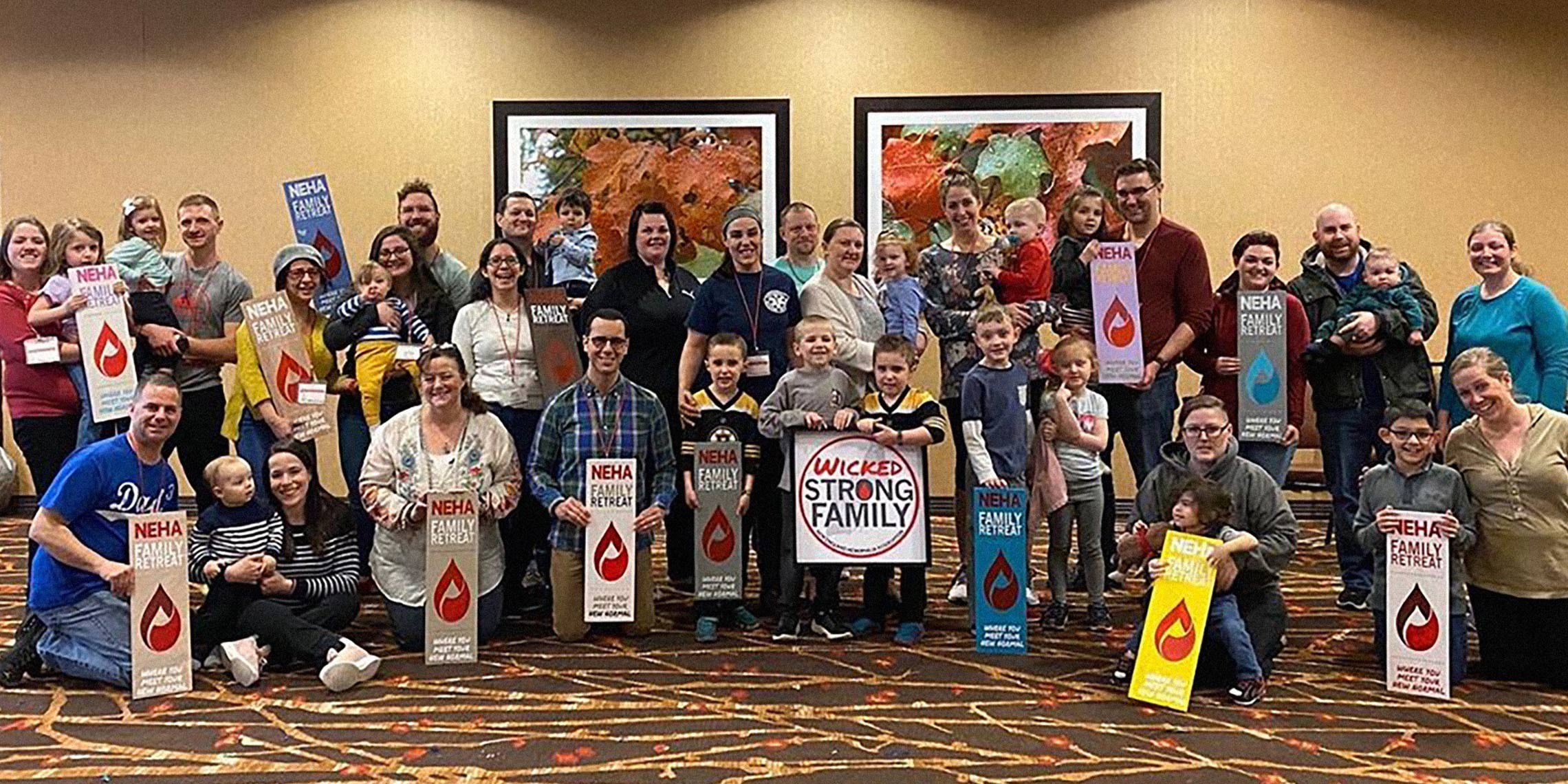
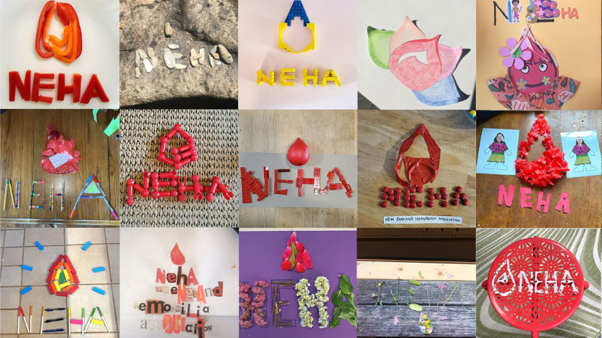
NEHA has proudly showcased their new identity and created a range of marketing and promotional materials to highlight this change. Reaction from their community has been enthusiastic and positive.
